Helpers
Clearfix
CSS에서 float를 사용을 할 때 clearfix 유틸리티를 추가하여 컨테이너 내에서 floating 된 콘텐츠를 빠르고 쉽게 정합니다.
Clearfix란?
버그라고 알려져 있고, CSS를 사용할 때 수없이 사용되는 필수 학습해야 하는 코드입니다. HTML 문서에서 부모 요소가 자식 요소를 감싸고 있을 때, 자식 요소에게 float 형식을 적용하면 부모 요소가 자식 요소를 더 이상 감싸지 않게 되고 높이 값을 파악하지 못하게 되는 버그가 발생합니다. 따라서 부모 요소의 높이 값이 0px로 출력되고, 전체적인 HTML 요소들이 뒤엉켜버리는 경우가 많습니다. 이때 부모 요소가 다시 자식 요소를 감쌀 수 있게 float을 초기화(clear) 하여 버그를 고쳐주는(fix) 코드가 필요한데 이것을 clearfix라고 합니다.
clearfix 미적용
버그로 인하여 부모 요소의 bg-info인 클래스가 적용되지 않는 모습을 볼 수 있습니다.
<div class="bg-info">
    <button type="button" class="btn btn-secondary float-start">
    Example Button floated left
    </button>
    <button type="button" class="btn btn-secondary float-end">
    Example Button floated right
    </button>
</div>
clearfix 적용
<div class="bg-info clearfix">
    <button type="button" class="btn btn-secondary float-start">
    Example Button floated left
    </button>
    <button type="button" class="btn btn-secondary float-end">
    Example Button floated right
    </button>
</div>
Ratio
생성된 가상 요소를 사용하여 요소가 선택한 가로세로 비율을 유지하도록 합니다. 부모의 너비에 따라 비디오 또는 슬라이드 쇼 내용물을 반응형으로 처리하는 데에 적합합니다.
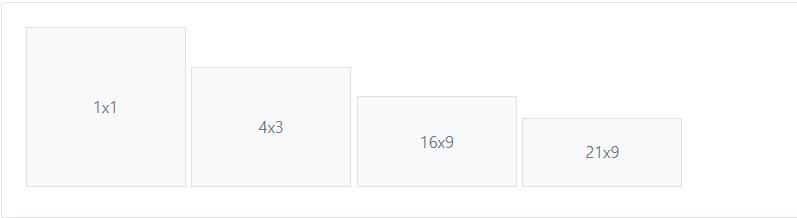
<div class="ratio ratio-1x1">
  <div>1x1</div>
</div>
<div class="ratio ratio-4x3">
  <div>4x3</div>
</div>
<div class="ratio ratio-16x9">
  <div>16x9</div>
</div>
<div class="ratio ratio-21x9">
  <div>21x9</div>
</div>
Position
요소들의 위치를 구성할수 있는 클래스들이 있습니다.
Stacks
CSS보면 레이아웃을 구성을 하는 경우에 flex-box를 많이 사용을 하는데 이때 구성요소를 가로 또는 세로로 배치하는 것을 알려주는 클래스들이 있습니다.
Visually hidden
화면상 안보이게 해주는 클래스
Text truncation
줄임표를 사용하여 긴 텍스트의 문자열을 자릅니다
Vertical rule
y축으로 선을 그어주는 클래스입니다.
참고자료
'WEB > Bootstrap' 카테고리의 다른 글
| [Bootstrap] Utilities 살펴보기 (0) | 2022.06.23 |
|---|---|
| [Bootstrap] Content, Forms, Components 살펴보기 (0) | 2022.06.18 |
| [Bootstrap] Layout 살펴보기 (0) | 2022.06.15 |
| [Bootstrap] 부트스트랩이란? (0) | 2022.06.10 |


댓글